New iPhone X Rules Expose Arrogant Apple

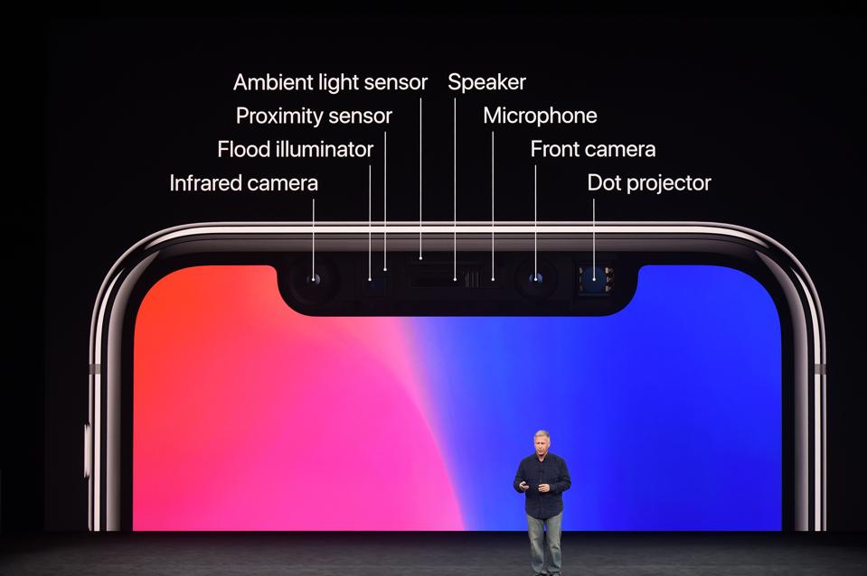
Apple’s iPhone X is many things to many people, but the key identifying feature of the notch for the FaceID sensors is something unique from Apple. It’s something that doesn’t put the user first.
If there’s one thing that Tim Cook and his team like to do, it is to go on about how it provides technology “in a way that only Apple can.” The ubiquity of wireless charging in the high-end Android space has been going on for years, but only now has Apple jumped on board. While it does use the Qi standard, it is using an older and slower version. You want faster charging? That will come with Apple’s proprietary system that will come out in 2018. Which is, in a way, technology delivering in a way that only Apple can.
But it’s not ‘new’ technology, so the iPhone X has to lean on another gimmick, that of facial recognition. While there are moments where FaceID will be a better choice than TouchID, I still feel there are far more situations where you would rather use TouchID. But Apple has decided that FaceID is the future, and this problem is the answer to a question.
I’m not sure that the question being answered was one set by the public. The implementation and draconian protection of the notch that holds the sensors feels like an edict from the marketing and design departments, rather than the team working on the human computer interface.
Take the shape of the iPhone X. This was something picked up by The Verge not long after the announcement of the latest smartphone from Cupertino. Up until that model, every iPhone had the circular home key and bezels in roughly similar proportions. That meant that a black outline of the bezels and a white circle under a white screen creates an iconic look. Marketing materials, website images, and in-app iconography could clearly identify that ‘this is an iPhone’.
With the move to ‘all screen’ smartphones and minimal bezels showing in the front-on profile, that iconography is lost in a sea of smartphones with the same design shape. From Samsung and Xiaomi, to Huawei and LG, and beyond, the smartphone is losing distinctiveness.
Not with the notch. Now the iPhone has something that makes it both ‘all screen’ and ‘all iPhone’. The notch is the identifier, and who cares how awkward and MacGyvered it looks.
The obvious solution - use the OLED properties to create a black strip including the notch for a solid status bar with signal strength, battery reserves and other indicators - has been disallowed by Apple. Because every iOS app goes through the App Store and has to meet Apple’s design criteria, the edict is to leave it alone. The notch must remain as Apple intended:
Don't attempt to hide the device's rounded corners, sensor housing, or indicator for accessing the Home screen by placing black bars at the top and bottom of the screen. Don't use visual adornments like brackets, bezels, shapes, or instructional text to call special attention to these areas either.
If it interferes with your app, if it creates awkward issues around scroll bars, text flow, landscape views, tough. Apple’s awkward notch is clearly vital to Apple, so do not minimize its impact.
Web designers have essentially been told the same, with an update to webkit adding in CSS code for ‘safe areas’ on the screen. In other words Apple’s funky design means that this edge to edge screen is actually a screen within some areas that you should never touch. Again Apple’s design instincts force everyone to follow its own vision… even if that vision is flawed.

The problem with all of these arguments is that they ride roughshod over the biggest concern that I have. How Apple is handling the Notch makes for a poor user experience.
That’s not to say that users will not become accustomed to it. The problems will always be there. Regular usage will mean that it is worked around, it will be accommodated, and it will become normalised…. but it will always be a tiny point of unacknowledged pain in use.
The notch might make for a poor user experience… but it makes for a great marketing experience. Is this what Apple is now? You should be able to draw strength from limitations, but when the limitations are self-inflicted and the simple solutions that improve the product are restricted, then the exercise becomes less about overcome adversity and more about projecting a message to the world.
And that message feels like “look at us! We’re Apple! We’re special!” If special is putting the marketing and branding before the consumer, then I agree.
Follow me on Facebook. Find more of my work at ewanspence.co.uk, on Twitter, and Linked In. You should subscribe to my weekly newsletter of 'Trivial Posts'.

0 comments here: